Things Are Looking A Little Different Around Here
If you’ve been watching us, you’ll notice a few things have changed around our website. Specifically, we overhauled the information architecture to help users answers their questions about Molecule more quickly. Now, you’ll find specific use cases informed by how our customers use Molecule today, directly on the home page.
More work, however, was our long-developed update to our logo and branding! When we launched Molecule in 2012, we had literally no code and no customers, but a strong vision of where we wanted to go.
"We started to see the advent of purpose-built, relatively inexpensive, and really great software. At that time, ease of use had become a mantra in the consumer software industry, but it hadn’t yet trickled to the
enterprise. I saw an opportunity for that." - Sameer Soleja, Molecule CEO and Founder
Since then, the many users of our platform have expressed clear preferences of where Molecule should go next: physical logistics/scheduling, and easy connectivity with upstream and downstream systems.
Our new branding reflects this while keeping to our core mission of easily, reliably managing risk for commodities portfolios. To talk more about the concept, here’s our designer, Jay Jimenea:
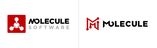
Exchange, transfer, flow, connectedness. Those are some of the concepts we wanted to reflect in our new logo. Those concepts represent motion, and there’s a ton of motion in Molecule. So many trades flow through Molecule on a daily basis, and with physical logistics and scheduling on the horizon, even more data will flow through the application. In addition, Molecule is becoming increasingly interconnected with upstream and downstream enterprise systems via our APIs. We thought we should capture this in the logo. While the methane logo provided a nice chemical icon to represent commodities, it did not visually capture the activity that transpires within Molecule. At quick glance, that logo could represent a chemical engineering firm if not for the word “software.” So, how could we visually capture motion and other desired concepts while maintaining the characteristics we liked from the previous design?
We achieved motion by using a pair of red tracks to form the letter “M” in the negative space between them. The nodes on the tracks are intended to represent points similar to what you might see on routes in map applications, train routes, or circuits on a circuit board. Each node is either a start or an end point. This creates a bidirectional movement between the nodes, guiding the eye back and forth between them. There’s movement created when just looking at the “M.” The nodes are also not far in appearance from the atoms in the methane icon.

Molecule is a software company that prides itself on simplicity for our users. Molecule’s UI removes the extraneous so users can focus on what they care about without distraction. Just like our application, we felt that we could remove from the logo as well. The word “software” was something we could remove if tech was represented elsewhere. The absence of “software” streamlines the design by removing clutter, and the circuit-like appearance of the “M” icon is undeniably a technology statement. That attribute is more than sufficient in reflecting the tech space and, in turn, software.
Molecule is bold in its messaging and aspirations, yet sensitive to human factors in its usability. The acute angles and sharp points of the new icon reflect the bold and aggressive attitude of the company, while the rounded nodes reflect Molecule’s sensible side. The connected “M” and “O” in the typeface was something we did like about the prior logo. It was the one quality that reflected motion, so we wanted to keep that posture intact. Plus, this strengthens the connectedness concept. The same bold lines and sharp angles from the new icon are mirrored in the “M” to extend the attitude into the Gotham typeface. (Sameer likes to call this the Vampire M.) The stylized “O” looks like an eye with its hawkish brow, further complementing the bold stance.
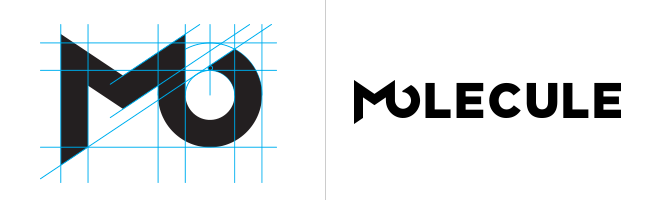
Gotham has been Molecule’s selected typeface from the beginning, and it continues to be. The font will not change in the Molecule application, marketing materials, or website. Gotham Black’s thick lines and wide curves continue to accompany our bold messaging and sensible style all at the same time. We love it.

We also still love our methane icon. We love it so much that it has also been updated for continued use. The new icon takes on a more simplified look, with removed outlines and updated shaping. The outlines were often lost when seen at smaller dimensions, so in the spirit of simplifying, they were removed. The icon will not take center stage as it used to, but it will continue to be seen throughout Molecule’s visual marketing.
Every angle and edge in the new logo is intentional and sculpted to convey exactly what Molecule is. We hope you like it!"
We’re proud of where we’ve come as a company, and we’re proud of our new design. We would love to hear your feedback and thoughts about the new look and feel, so please don’t hesitate to contact us at info@molecule.io.